Choosing Paint Colors: Why So Hard?
You love color, but the idea of being left to choose paint for an accent wall, a whole room – or worse, your entire house – seems like a daunting task. It’s true – one of the toughest things to do is when it comes to renovating your home is selecting a paint color. Perhaps the only thing that rivals paint selection in terms of difficulty is its importance. In fact, the colors we choose are often the elements the rest of our aesthetic choices are based on.
Throughout my professional experience, I’ve seen clients fall in love with a color sample, but when it goes up on a wall, it is far from what they had envisioned. You may pick a color for your bedroom and love it in the morning when you first get up and hate it in the afternoon. That isn’t just because you were in a better mood when you had your morning coffee. (Well, maybe a little) Your change of heart is probably from the natural light shifts — it can be totally different again in the evening once you turn on the lights.
So how do you make sure that paint looks the way you want it to look and stay that way? Have no fear! One of the things I love about my job as Color Expert at JKN Design Services is how I get to share some secrets that I have learned to help guide you towards the palette that is perfect for your house.

1. Go With Grays
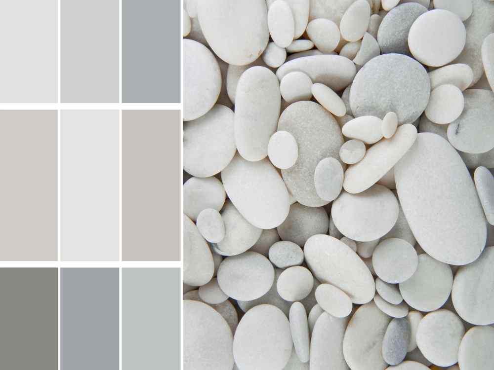
Forget white and beige. From near black to pale silvers, there’s a shade of gray to fit any space. When it comes to neutrals, gray has a chameleon-like quality that allows the color to appear either warm or cool and can pair perfectly with pastels and bold bright shades.

2. Use Testers
Grab some testers of different colors and shades you’re considering. Paint a large enough area so that you can see how the light hits it at all different times of the day. We want to avoid those colors that look good at night, but turn out to be a mistake the next morning when the sun comes up (what we call “one-night shades”). All brands should have testers available for a few dollars. Trust me – it’s worth it to test in your space. We certainly don’t want you to buy gallons of the color to spend hours painting up until mid-afternoon before you realize you’re really not that into it.
3. Think About the Colors Against Your Furniture and Fabrics
Don’t only test colors on the wall. Paint a piece of poster board and hold it up against your sofa, drapes, accent chairs or other items that will be in the room. It doesn’t have to match perfectly per se, but you do want the undertones to go nicely. You’ll know it when you see it!
4. Understand Undertones
First, paint colors have undertones and masstones. The masstone is the color that even my fiancée could pick out Its the main component of the color, like when he refers to BEHR Casual Khaki as “brown”. The undertone is the factor that distinguishes your color from other similar colors. The easiest way to compare the undertones of these similar colors is with a color strip. The darkest color on the color strip sample is going to help you determine the true color. This will save you from a color that is too pink, too yellow, etc.
And what about hue? Tint? And Shade? Just remember “Hue” is the color … red, green, blue, etc. Tint and Shade are terms used to describe how a color varies from its original hue. If white is added, the lighter version of the color is called a tint of the color. On the other hand, if black is added the darker version of the color is called a shade of the color.
5. Know the Right Sheen to Use
If there’s any sheen in a paint, it will show flaws, so if you are trying to mask flaws go with as little sheen as possible.
Here are some general guidelines for the different finish choices:
· Flat (Matte): No shine at all. Perfect for low traffic areas like living rooms and bedrooms, as well as ceilings.
· Flat Enamel: Has almost no shine but is a bit easier to clean than flat paint. This is also perfect for low traffic areas but may be a better choice if you have kids or pets.
· Eggshell Enamel: Has a tiny bit of shine and is a good choice for moderate traffic areas such as living rooms. In my experience most scuffs can be wiped off of this surface with a damp cloth.
· Satin Enamel: Has a bit more shine and works well in high traffic areas or areas that have moisture. It is also super wipeable which is why it is perfect for kitchens and bathrooms.
· Semi-Gloss Enamel: Shiny but not glass-like. This is what you should use on cabinets and trim, or in really high moisture areas.
· Hi-Gloss Enamel: Shiny! This gives an almost glass-like finish and is perfect for high use surfaces (like a railing) or furniture.

6. Pick a Color Scheme
Model homes are a perfect example of having a color scheme throughout a home. They typically keep the main living space neutral and use fabrics and accessories to add color. The bedrooms may have accent colors and then keep the accessories and bedding neutral.
I’m not suggesting you have to follow this rule, but especially in rooms that open into one another, you should consider a complimentary color. It is perfectly fine if you decide to play it safe and go with one color throughout the house! When clients choose to do so, I like to go a few shades lighter or darker in one room or even use a focal wall. It is a great way to add depth and interest to a space.

7. Use a Pop of Color in Small Spaces
If you have a small room in your house, don’t paint it white to make it seem bigger. Instead, give it more oomph with a look-at-me color choice. Let your big rooms expand with light, and your small rooms envelop you.
8. Let Your Personal Style Show
You can make any color look good as long as it truly suits your personal style. People appreciate your authenticity, even if they would never decorate their home the same way. If you want to make every room pink, go for it. Let your colors be a representation of you!